When you are contributing to the Cloudflare Docs, you can use our custom components to add additional formatting, such as buttons, tabs, and collapsible sections.
This guide shows you the basics of importing and adding a component to a page. Refer to each component page in this Style Guide to learn the specific props and requirements for each.
Our components are based on Astro components ↗ and are written in MDX ↗, an extended version of Markdown. Learn more about the Cloudflare Docs framework.
To add a component to a page:
Import the component to the page by adding this text directly below the frontmatter:
import { COMPONENT_NAME } from "~/components";
;
For example, if you were to add the DashButton component to the Images getting started page, the top of the MDX file corresponding to that page would look like the following:
---pcx_content_type: get-startedtitle: Getting startedsidebar:  order: 2---
import { DashButton } from "~/components";
;
Add the component to the page by adding this text anywhere on the page you want the component to appear:
<COMPONENT_NAME PROP_NAME="PROP_VALUE" />For example, if you were to add the DashButton component to some steps in the Images getting started page, here is how the MDX file would look:
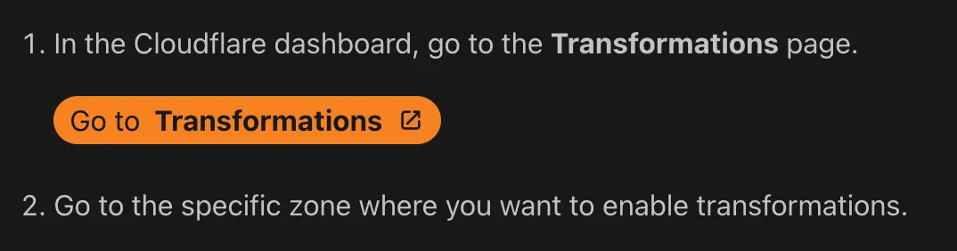
1. In the Cloudflare dashboard, go to the **Transformations** page.
   <DashButton url="/?to=/:account/images/transformations" />
2. Go to the specific zone where you want to enable transformations.
This is how this example would display after it is published:
To choose the right component for your use case, browse this table which contains our most commonly used components and a visual example of each. For full documentation on all available components and their use cases, browse the individual component pages in this Style Guide.
| Component | Description & visual example |
|---|---|
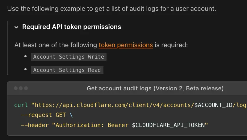
APIRequest | Styled API request block. Generate executable cURL API commands with the required API token permissions.
|
Badge | Small descriptive pill. Label content with status, version, category, or other short metadata.
 |
DashButton | Dashboard deep-link button. Directly link users from documentation into a specific, relevant section of the Cloudflare Dashboard.
 |
Details | Click-to-expand content block. Hide non-essential, complex, or advanced technical content, allowing users to expand the section when needed.
 |
DirectoryListing | Auto-generated sub-page list. Automatically generate a navigable list of links to sub-pages within a specified documentation folder path.
 |
Feature | Product feature list item. Highlight a product feature with a description and a direct link button.
 |
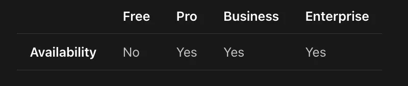
FeatureTable | Product plan comparison table. Display detailed feature information, including availability across different Cloudflare pricing plans.
 |
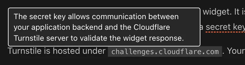
GlossaryTooltip | Hover-activated glossary popup. Provide non-disruptive, hover-activated definitions for technical terms pulled from the documentation glossary.
 |
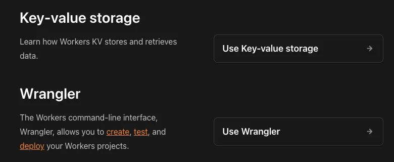
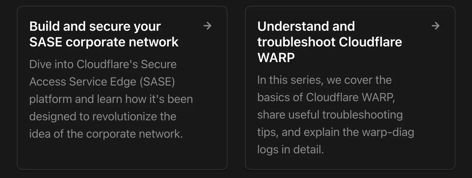
LinkCard | Navigational cards. Present related tutorials, concepts, or guides in a visually engaging format.
 |
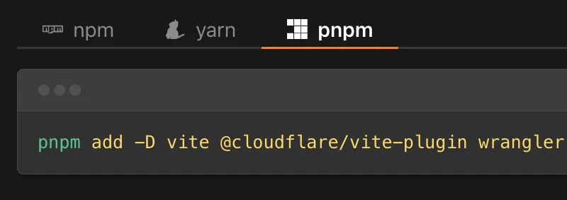
PackageManagers | Command switcher tabs. Display equivalent installation or execution commands for different package managers.
 |
Plan | Product plan availability badge. Show the plan required for a product or specific feature.
 |
RelatedProduct | Formatted product reference. Visually highlight and link to a specific, complementary Cloudflare product, also featuring the product's logo.
 |
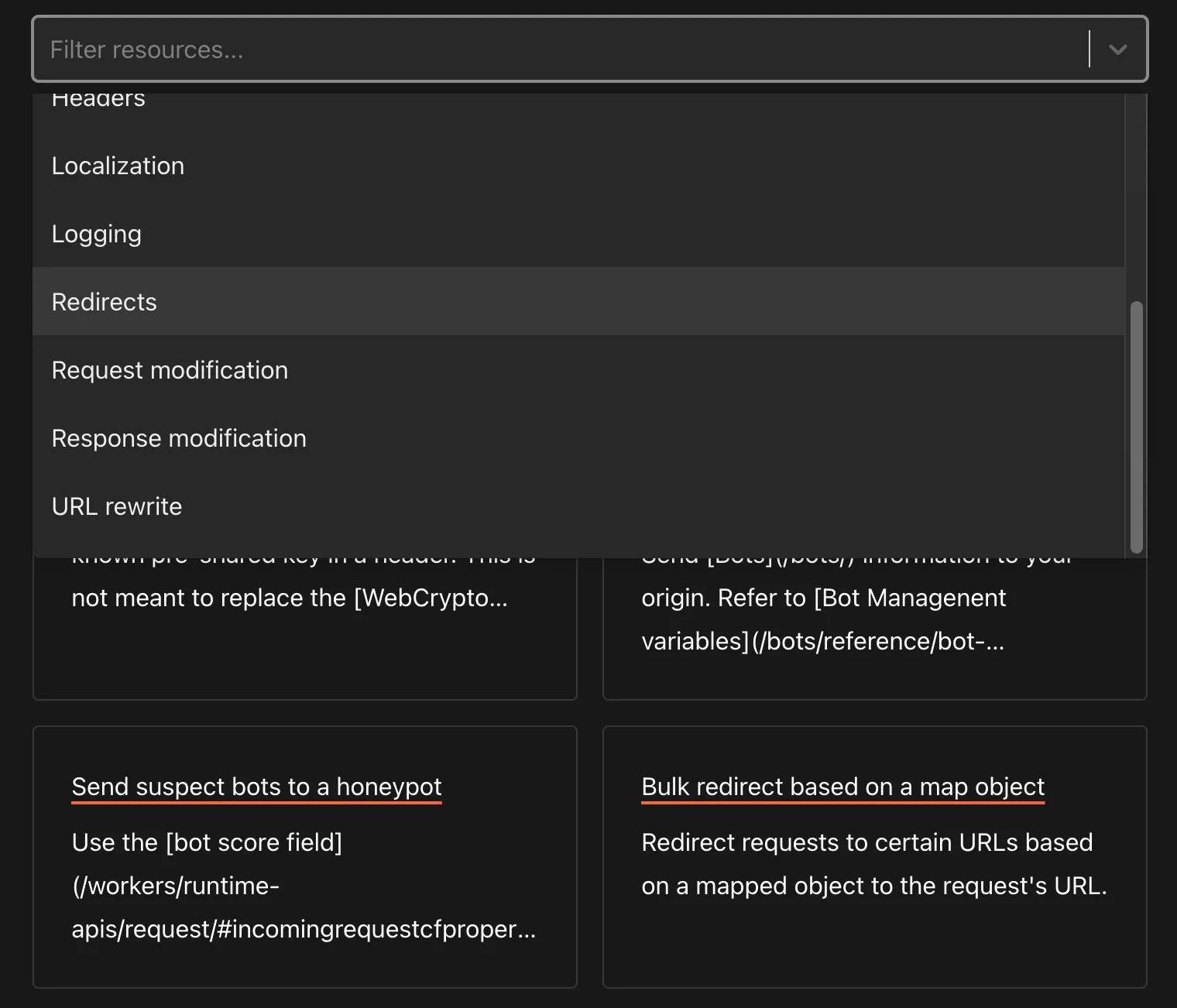
ResourcesBySelector | Filterable code example library. Pull and display lists of code examples and resources based on tags and content type.
 |
Stream | Embeddable video player. Display a video player optimized for Cloudflare Stream.
 |
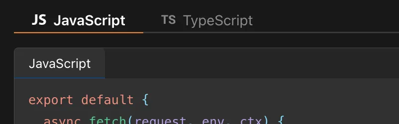
Tabs and TabItem | Switchable content tabs. Allow easy switching between content views for different code languages or configuration methods.
 |
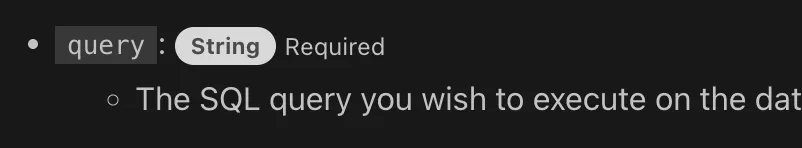
Type and MetaInfo | Pill-shaped data type badge and metadata annotation about a field or property.
 |
WranglerConfig | Tabbed Wrangler config display. Show Wrangler configuration files (JSONC and TOML) and bindings with automatic format switching.
 |
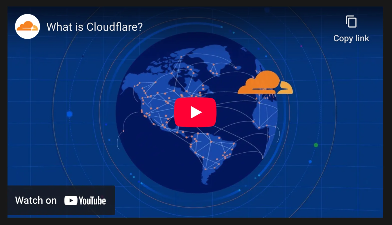
YouTube | Embeddable video player. Embeds a YouTube video player with a specified video ID.
 |