UI elements
UI elements are the interactive parts of a product. They are used to build the software's interface. When describing UI elements in writing, we focus on what users need to do without focusing on the UI.
To clarify instructions for complex interfaces, you may need to identify elements by name.
| UI element | Usage | Example |
|---|---|---|
| Button | Select Add a Site. | 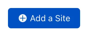 |
| Checkboxes and radio buttons | Turn Set as Default DNS Location on. | 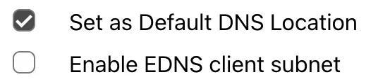 |
| Commands | Go to File, then select Delete. |  |
| Error message | If you receive the error message Invalid IP, start the process from the beginning. | 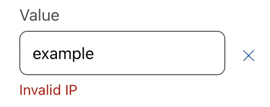 |
| Menu | In the menu, go to your account > Websites. | 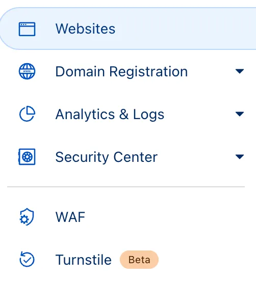 |
| Tab | Go to Action. | 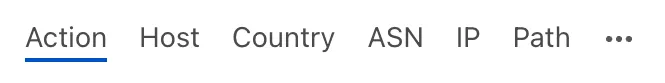 |
| Toggle | Turn AV inspection on. | 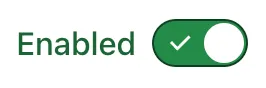 |
| Containers (windows, screens, pages, sections, and cards) | Refer to your site's traffic statistics for more information. |  |
When describing navigation elements, such as menus, use go to instead of navigate. When describing elements you can activate, such as checkboxes and toggles, use turn on/turn off instead of enable/disable.
For information on physical inputs, such as mouse buttons, refer to Keyboard keys.
The names or labels on buttons and other UI elements may include icons or symbols. For example, a button named + Add element includes a plus sign. When writing these names or labels in procedures, do not include symbols. They are usually redundant and can be removed safely.
If an element has no text other than the symbol (for example, just +), you can keep the symbol in the instructions. This especially applies to instructions in interfaces for third-party products.
An ellipsis is a set of three dots (...) that might be used as a variable or wildcard. For example, a Save As... menu item might display a dialog box where you can save a file in different places. If you refer to a menu item or button that has an ellipsis, do not include the ellipsis. In text, ellipses can be distracting.