Adjust the time range
Use the timeframe drop-down list to change the time range over which Network Analytics displays data. When you select a timeframe, the entire view is updated to reflect your choice.
In the Network Analytics dashboard, the range of historical data you can query is 112 days.
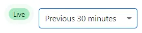
When you select Previous 30 minutes, the Network Analytics card will show the data from the last 30 minutes, refreshing every 20 seconds. A Live notification appears next to the statistic drop-down list to let you know that the view keeps updating automatically:
To zoom in a specific period, select and drag to define a region in the Packets summary (or Bits summary) chart. To zoom out, select X in the time range selector.

The effective resolution goes up when you zoom in and goes down when you zoom out, due to the Adaptive Bit Rate. This means that a big packet burst that lasted a few seconds may look less impactful when analyzing a chart displaying data for 24 hours or more.