Flex container
The <Flex> component is intended for showing multiple images in a responsive layout.
A row layout is used on medium-large viewports (i.e laptops or desktops), and a column on small viewports (i.e mobile devices).
import { Flex } from "~/components";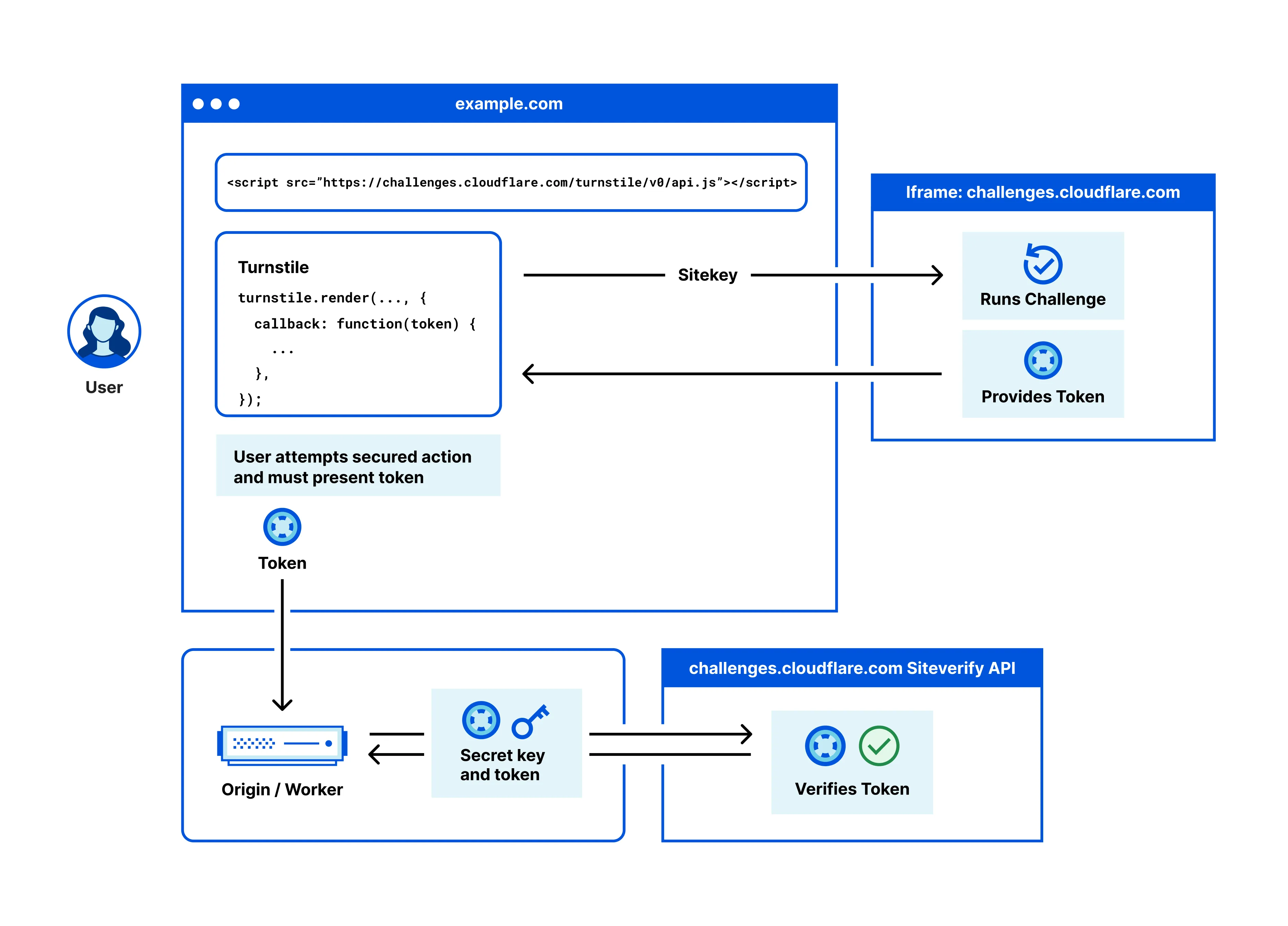


import { Flex } from "~/components";
{/* Make sure there is a newline between images, or Markdown groups them inside one <p> element. */}
<Flex>
</Flex>
<br />
<Flex>

</Flex>Was this helpful?
- Resources
- API
- New to Cloudflare?
- Products
- Sponsorships
- Open Source
- Support
- Help Center
- System Status
- Compliance
- GDPR
- Company
- cloudflare.com
- Our team
- Careers
- 2025 Cloudflare, Inc.
- Privacy Policy
- Terms of Use
- Report Security Issues
- Trademark